As you progress in web development, it becomes easier to think of styles as modes, a way of viewing a site in different contexts and on different devices. The content of your site is HTML: static, unchanging data. CSS acts as a filter, emphasizing, reducing, eliminating or moving content in a way appropriate to each client.
You can embed your print styles directly in HTML, but this will cause an extra HTTP request, which may slow down the page loading:
<link media="print" href="printable.css" />The best way to embed print styles is to declare the @media query, that was introduced since CSS3 released:
@media print {
    /* print styles go here */
}
Between the opening and closing curly braces you will be writing the style rules for your pages when they are printed. There is no need to duplicate your earlier rules, only to indicate what is different when a page is printed. However, you are not limited to writing stylesheets, you could make the printed page appear completely different from the web version.
Hide elements that are irrelevant to the printed page
When someone prints your site, they are interested in content, and everything else, like navigation bars, headers, and footers aren't relevant to the content. Therefore, in the print @media query, we turn off their visibility.
header, footer, nav, aside, .non-printable {
    display: none;
}
Hide background images, and change colors to high-contrast
Make sure you are setting background-image: none in your @media print rules for elements that have a background image set. Also we should reset styles like color, box-shadow and text-shadow to be better seen on the paper.
*:not(a),
*:not(a):before,
*:not(a):after,
*:first-letter:not(a),
p:first-line,
div:first-line,
blockquote:first-line,
li:first-line {
    background: transparent !important;
    color: #000 !important;
    box-shadow: none !important;
    text-shadow: none !important;
}
Force background printing
On the other hand, you might be interested to force browser to display background, so we need to overwrite the default settings for some browsers:
header {
    -webkit-print-color-adjust: exact;
    print-color-adjust: exact;
}
Use absolute units (which are not pixels) for measurements
"Pixels" have no relevance to the printed page, and you can usually assume that any printer is using standard paper. Responsive design principles – measuring most elements in percentages or other scalable units – usually works best, but it's also safe and recommended to use absolute units like cm (centimeters), mm (millimeters), in (inches), pt (points) or pc (picas).
header {
    margin-bottom: 1cm;
}
Revealing links and abbreviations
Obviously, the reader cannot "click" on the printed page to see where a link goes. However, it is still useful to indicate URL addresses. To do this, we use some advanced CSS in the @media print section:
a[href^=//]:not([href*="example.com"]):after,
a[href^=http]:not([href*="example.com"]):after {
    content: " <" attr(href) ">";
}
These lines mean, we can filter links to show only external links, as we don't want to show reference of the a tag, that could be used as an anchor.
Abbreviations should be wrapped in abbr elements and their expansions included in the title attribute. It makes sense to display those on printed pages:
abbr[title]:after {
    content: " (" attr(title) ")";
}
Force page breaks
Since printed pages aren’t endless like web pages, content will eventually break on one page and continue on the next page.
Page breaks before an element
You might wish each product presented on the site to be printed on a new page, or a fresh page used for every individual entry on a blog. If you have been consistent in your markup, and use an h2 element exclusively for each new item, you could write the following within your @media query:
h2 {
    page-break-before: always;
}
It ensures that when an h3 element will be encountered, it always starts a new page: for all intents and purposes, h2 elements become page headings when printed. The one downside to this approach is that your first page may be essentially blank, or very short.
When you have a series of article entries presented on the same web page, you might like to start a new page when an article follows another article:
article + article {
    page-break-before: always;
}
Page breaks after an element
We can prevent page breaks right after sub-headings because that looks odd:
h3, h4, h5, h6 {
    page-break-after: avoid;
}
Page breaks inside an element
While browsers will logically split long paragraphs across pages when they are printed, you typically do not want that to occur to images, tables, lists and other elements:
ul, pre, code, blockquote, table, img {
    page-break-inside: avoid;
}
Widows and Orphans
Sometimes you may not want to force a page break, but at least control how many lines are displayed on the current or the next page.
if the last line of a paragraph doesn’t fit on the current page, the last two lines of that paragraph will be printed on the next page, because the property that controls this, widows is set to 2 by default. If it's the other way around and only one line fits on the current page, the whole paragraph will be printed on the next page. The property responsible for this behavior is orphans and its default value is 2 as well. But we can overwrite these values:
p {
    widows: 4;
    orphans: 3;
}
Testing
You don't have to print a page every time you make a small change. Depending on your browser you can export the page as a PDF, show a print preview or even debug directly in the browser.
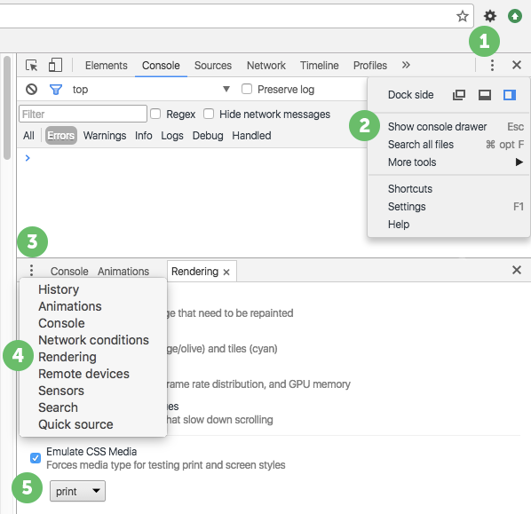
The most convenient way to check your printable stylesheets is probably Google Chrome built-in functionality in DevTools. It could emulate CSS media to preview the page.
ResourcesClick to expand/shrink